
The Story of Hiroshi Nagai
From mid-century inspirations to iconic city pop album covers — a conversation with Hiroshi Nagai. September 8, 2025
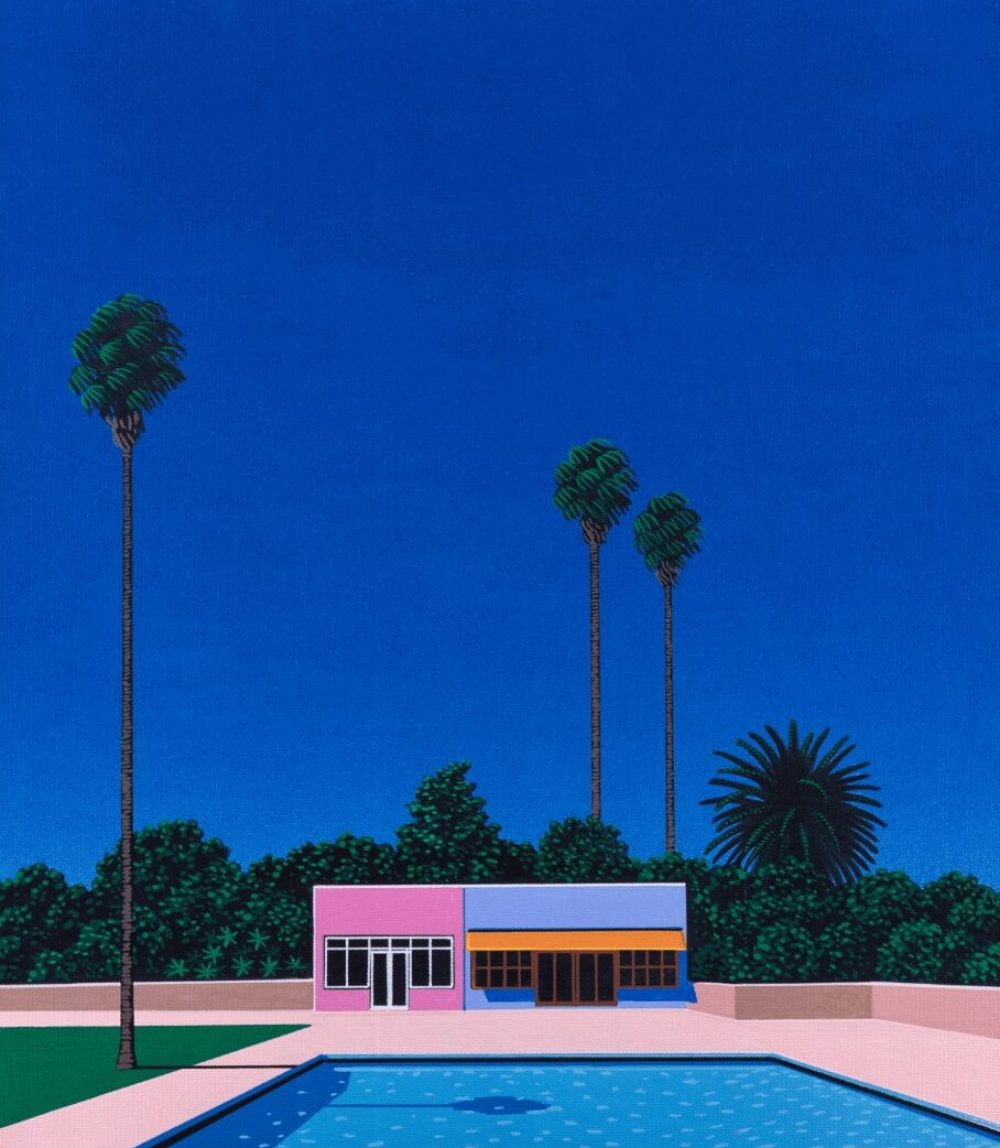
Renowned for his radiant skies, tranquil coastlines and endless sunsets, Hiroshi Nagai captures the elusive beauty of summer like a dream that never fades. Sun-drenched, quiet, and suspended between nostalgia and serenity, his scenes are composed with cinematic precision and bathed in perfectly balanced, luminous colour — timeless icons of Japanese pop culture and of the collective visual memory.
(Recorded and transcribed by Sayaka Shibata, Tokyo — July 31, 2025)
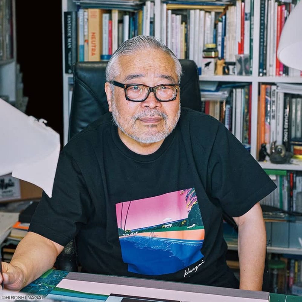
(Photo of Hiroshi Nagai by Uniqlo)
SS: Your work evokes a timeless, almost dreamlike summer. What does this “eternal summer” mean to you personally, and how has that vision evolved since the 1980s?
HN: Honestly, it hasn’t changed since the 80s. In the mid-1970s, I travelled to places like America and Guam. Those summer experiences stayed with me. In the 80s, because of advertising shoots, I often went to Hawaii. That’s when I painted — not so much the real landscapes I saw there, but the idea of the South Seas and Los Angeles as they’re felt from Japan. That’s what I was painting.
I was never really drawn to new scenery. Even with hotels — I preferred not the brand-new luxury ones along the beach, but the small hotels tucked away on side streets. Same with souvenir shops — I liked the unsold, leftover items, not the flashy new ones.
“I preferred mid-century houses and American films set in the South. Not westerns, but contemporary films from the 60s and early 70s, with those cars, that atmosphere.”
SS: So even back then you were drawn to things steeped in history, in nostalgia.
HN: Exactly. When I first went to Los Angeles in 1973, the city already had many old buildings. I bought a lot of images and reproductions of those places.
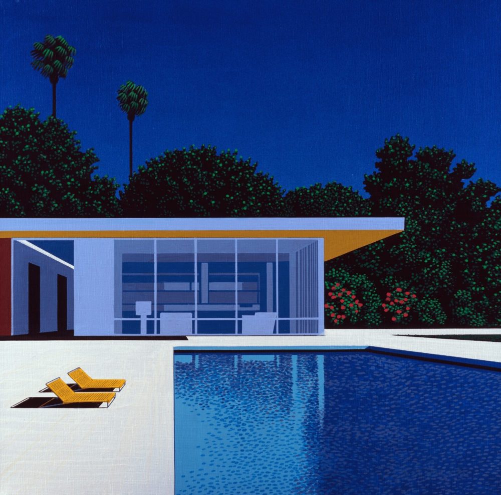
SS: And did your love of mid-century design also emerge in that period?
HN: Yes. At first I loved Corbusier-style interiors when I started working. But once that trend spread everywhere — into offices, everywhere — I’d had enough. I then came to prefer mid-century houses and American films set in the South. Not westerns, but films from the 60s and early 70s, with those cars, that atmosphere. Never anything brand new.
SS: You were born in 1947, so it’s really the period right after your birth that left its mark on you.
HN: Yes. More the 60s than the 50s. The 50s were too rock’n’roll. What resonated with me was the balance — between architecture, furniture and magazines. Even in Tokyo, back then, you could still find mid-century books cheaply, because nobody was collecting them. That’s where I drew my references from.
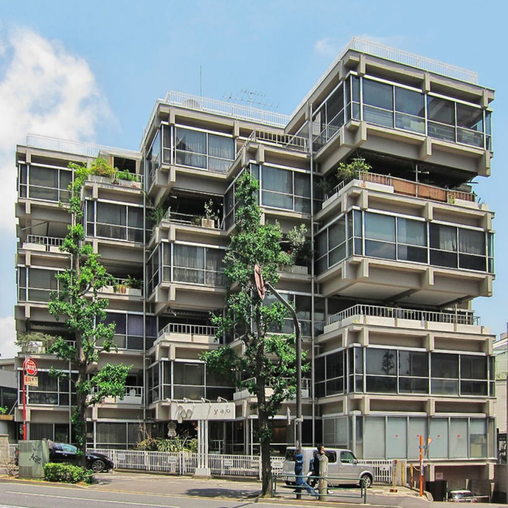
(Villa Bianca studio, Tokyo)
SS: A great deal of your work took shape after you moved to Tokyo, then.
HN: Completely. Growing up in the countryside, there was nothing — no art beyond what we covered in high school classes. In Tokyo, and especially after my trip to America in 1973, I was overwhelmed by influences. That trip lasted about forty days. I remember stepping out of San Francisco airport — the sunlight, the parked cars casting deep black shadows — it was exactly the kind of scene I would later paint.
SS: Were those trips the main reference for your work?
HN: They left impressions on me, but I never used them directly as sources. My real references came from books, photo collections, interior design magazines, postcards. Otherwise, painting becomes too tied to personal memory.
“I was first drawn to surrealism, then to American pop art.”
SS: And yet your work feels cinematic — influenced by surrealism, by pop art, but with more silence.
HN: I was first drawn to surrealism, then to American pop art. Surrealism was too dark, pop art too cheerful. My own work blends the two — the landscape itself is calm, almost dark, but bathed in strong light that makes it glow.
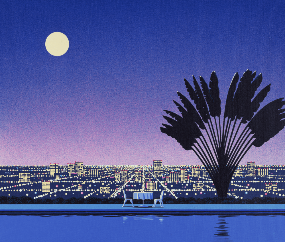
SS: This silence, this absence of figures — it comes up again and again in your paintings.
HN: Yes. It wasn’t something I consciously decided. Critics were the ones who pointed it out later. If you add figures, the scene starts to tell a specific story, and the painting becomes like a comic panel. Without figures, the space stays open, more universal. It also avoids questions of race — if I painted someone Asian, the viewer would immediately place the scene in Asia. I preferred a landscape anyone could project themselves into.
SS: Your work feels both architectural and emotional — silent pools, endless skies, modern buildings. Are these memories, metaphors, or imagined spaces?
HN: From imagination. I reconstruct them, combining elements. I used to measure everything precisely — the height of the horizon, the width of the sky. Later, as the canvases grew larger, it became instinctive. It’s a question of balance, distance, depth. Not an outside influence — just my own sense of harmony.
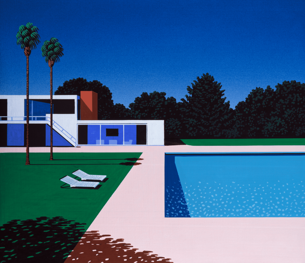
SS: And music? You’ve made many city pop album covers, but you also collect black music records. Has that influenced your work?
HN: Not at all. City pop came to me — musicians approached me for cover art. If I’d adapted my paintings to their music, they would have become kitsch. As for listening to music while painting, I rarely do — handling records is too much of a hassle. Sometimes the radio, but that’s it.

SS: In recent years, the vaporwave and retro-futurist scene has often referenced your early work. How do you feel about this young digital generation influenced by you?
HN: Honestly, I don’t see many people doing it well. Some imitate the surface patterns without real mastery. If someone truly talented did it, it might even scare me.
“City pop came to me — musicians approached me for cover art.”
SS: For your European audience — what kind of experience would you like them to take from your work?
HN: That’s not for me to decide. Viewers bring their own emotions to it. Many tell me my work feels nostalgic, even Americans. If it brings them a sense of well-being, that’s enough.
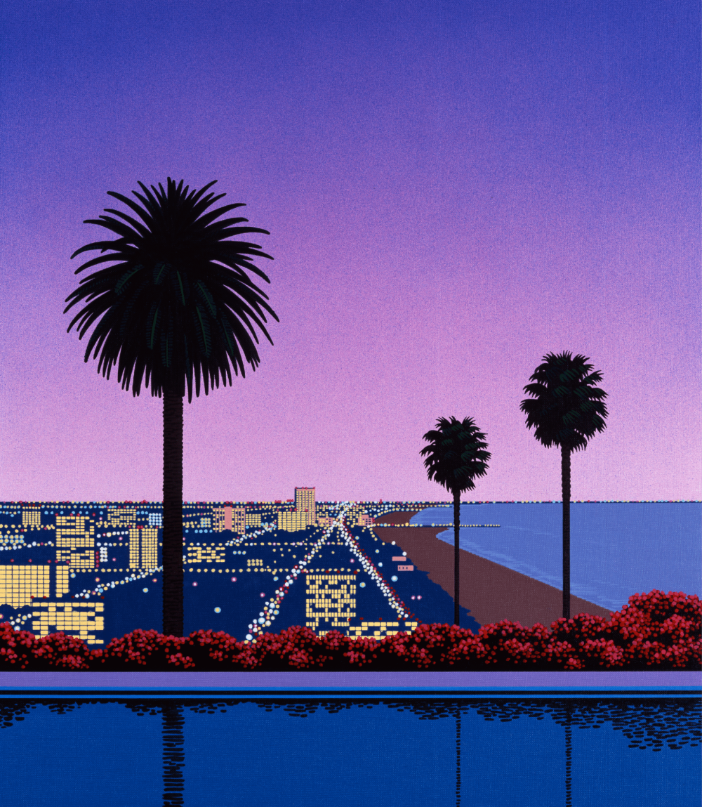
SS: One last question. There’s a piece that many people love — often described as especially quiet, poetic, introspective. Can you tell us about it?
HN: It came from looking at a floral wallpaper pattern in an interior design magazine. I thought: what if this pattern existed outside, on a terrace wall? So I painted it. Not everything has deep meaning. I’m not a novelist — these are images of “what if.” Scenes I’d like to see exist. A palm tree leaning just right, a simple building glowing under strong light. Places that may not exist in reality, but should.
SS: That feeling of “I wish this existed” resonates universally — whether in Japan, America, or Europe.
HN: Yes. That’s good enough for me.
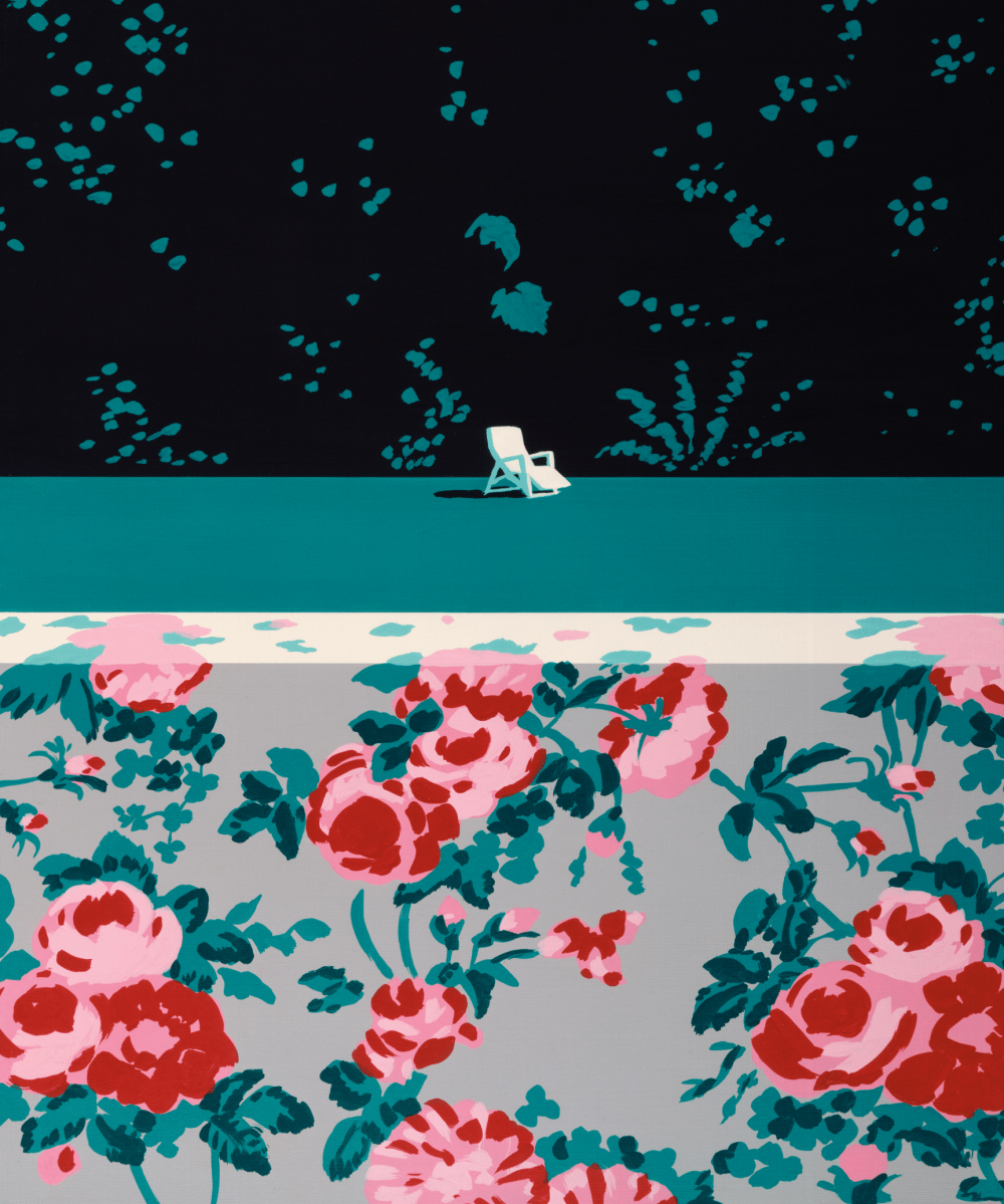
Composed with cinematic precision and bathed in perfectly balanced, luminous colour, his scenes have become timeless icons of Japanese pop culture and of the collective visual memory.
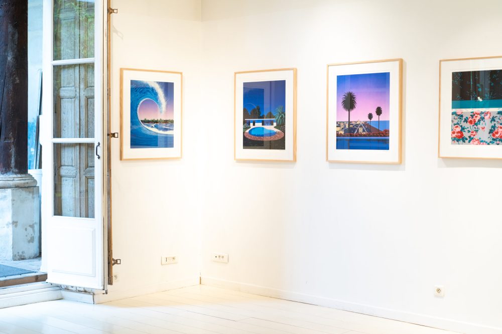
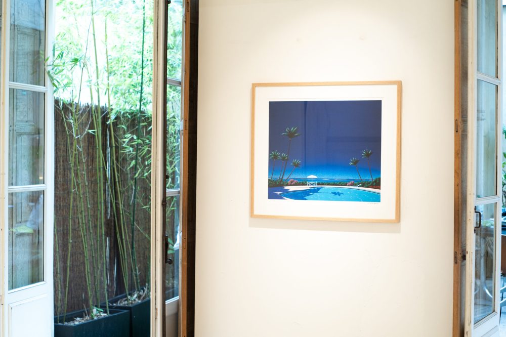
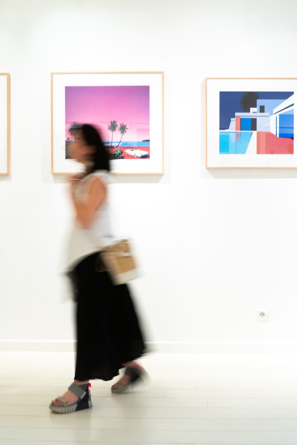
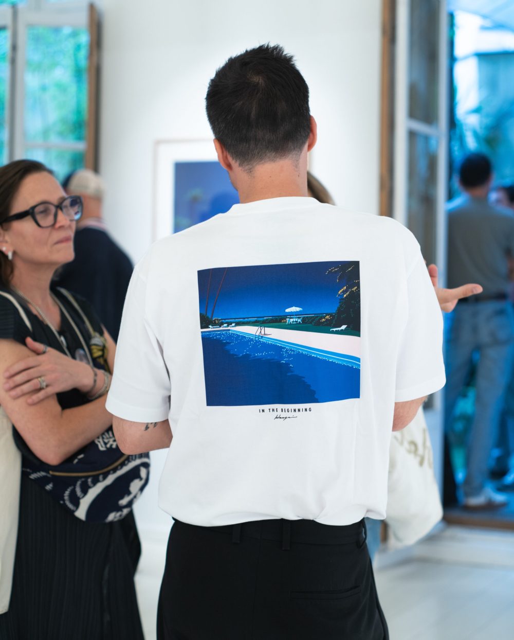
(Photos from the exhibition “Somewhere it’s still Summer” at Sato Gallery)